
Concept explainers
Videos
The bar graph shows the differences among age groups on the Implicit Association Test that measures levels of racial prejudice. Higher scores indicate stronger bias.
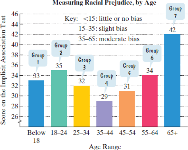
Source: The Race Implicit Association Test on the Project Implicit Demonstration Website
(Refer to the graph shown at the bottom of the previous page.)
- a. The data can be described by the following polynomial model of degree 3:
In this polynomial model, S represents the score on the Implicit Association Test for age group x. Simplify the model.
- b. Use the simplified form of the model from part (a) to find the score on the Implicit Association Test for the group in the 45–54 age range. How well does the model describe the score displayed by the bar graph?
Want to see the full answer?
Check out a sample textbook solution
Chapter P Solutions
College Algebra Essentials (5th Edition)


 Algebra & Trigonometry with Analytic GeometryAlgebraISBN:9781133382119Author:SwokowskiPublisher:Cengage
 Glencoe Algebra 1, Student Edition, 9780079039897...AlgebraISBN:9780079039897Author:CarterPublisher:McGraw Hill
 College Algebra (MindTap Course List)AlgebraISBN:9781305652231Author:R. David Gustafson, Jeff HughesPublisher:Cengage Learning