
Videos
82. National Debt The size of the total debt owed by the United States federal government continues to grow. In fact, according to the Department of the Treasury, the debt per person living in the United States is approximately (or over per U.S. household). The following data represent the U.S. debt for the years 2001—2014. Since the debt D depends on the year y, and each input corresponds to exactly one output, the debt is a function of the year. So D(y) represents the debt for each year y.
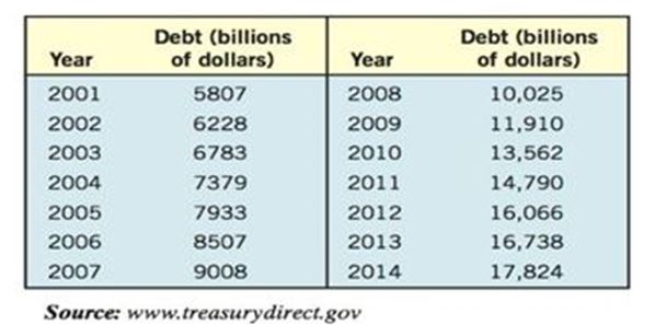
(a) Plot the points , , and so on in a Cartesian plane.
(b) Draw a line segment from the point to . What does the slope of this line segment represent?
(c) Find the average rate of change of the debt from 2002 to 2004.
(d) Find the average rate of change of the debt from 2006 to 2008.
(e) Find the average rate of change of the debt from 2010 to 2012.
(f) What appears to be happening to the average rate of change as time passes?
Want to see the full answer?
Check out a sample textbook solution
Chapter 2 Solutions
Precalculus Enhanced with Graphing Utilities (7th Edition)


- World Military Expenditure The following chart shows total military and arms trade expenditure from 2011–2020 (t = 1 represents 2011). †A bar graph titled "World military expenditure" has a horizontal t-axis labeled "Year since 2010" and a vertical axis labeled "$ (billions)". The bar graph has 10 bars. Each bar is associated with a label and an approximate value as listed below. 1: 1,800 billion dollars 2: 1,775 billion dollars 3: 1,750 billion dollars 4: 1,730 billion dollars 5: 1,760 billion dollars 6: 1,760 billion dollars 7: 1,850 billion dollars 8: 1,900 billion dollars 9: 1,950 billion dollars 10: 1,980 billion dollars (a) If you want to model the expenditure figures with a function of the form f(t) = at2 + bt + c, would you expect the coefficient a to be positive or negative? Why? HINT [See "Features of a Parabola" in this section.] We would expect the coefficient to be positive because the curve is concave up. We would expect the coefficient to be negative because the…arrow_forwardEXERCISE 1.3arrow_forwardThe table shows the historical in-state tuition rates for the University of Kalamazoo. Use the data to answer the questions and round your answers to two decimal places. Academic year Rate of tuition for one semester 2008–2009 $3,812 2009–2010 $4,002 2010–2011 $4,441 2011–2012 $4,905 2012–2013 $5,181 What is the percentage increase in tuition from the 2008–2009 school year to the 2012–2013 school year?arrow_forward
- Q1. The table provided gives data on indexes of output per hour (X) and real compensation per hour (Y) for the business and nonfarm business sectors of the U.S. economy for 1960–2005. The base year of the indexes is 1992 = 100 and the indexes are seasonally adjusted. a. Plot Y against X for the two sectors separately. b. What is the economic theory behind the relationship between the two variables? Does the scattergram support the theory? c. Estimate the OLS regression of Y on X. Note: on the table ( 1. Output refers to real gross domestic product in the sector. 2. Wages and salaries of employees plus employers’ contributions for social insurance and private benefit plans. 3. Hourly compensation divided by the consumer price index for all urban consumers for recent quarters.) Thank you!arrow_forwardQ. Table gives data on gold prices, the Consumer Price Index (CPI), and the New York Stock Exchange (NYSE) Index for the United States for the period 1974 –2006. The NYSE Index includes most of the stocks listed on the NYSE, some 1500-plus. a. Plot in the same scattergram gold prices, CPI, and the NYSE Index. b. An investment is supposed to be a hedge against inflation if its price and /or rate of return at least keeps pace with inflation. To test this hypothesis, suppose you decide to fit the following model, assuming the scatterplot in (a) suggests that this is appropriate: Gold pricet = β1 + β2 CPIt + ut NYSE indext = β1 + β2 CPIt + ut Note that if beta2 = 1 the response exactly grows with CPI Thank you!arrow_forward1. Make a scatter plot of the table provided in the image. B. Write a linear/exponential equation that models this table provided in the image. C. Explain what the slope/multiplier means in the context of the problem. E. Use your model to predict when there will be 100 new casesarrow_forward
- I. Starbucks Stores (Modeling) We all know that the number of Starbucks stores increased rapidly during 1992–2009. To see how rapidly, observe the following table, which gives the number of U.S. stores and the total number of stores during this period. Year Number of U.S. Stores Total Stores 1992 113 127 1993 163 183 1994 264 300 1995 430 483 1996 663 746 1997 974 1121 1998 1321 1568 1999 1657 2028 2000 2119 2674 2001 2925 3817 2002 3756 5104 2003 4453 6193 2004 5452 7567 2005 7353 10,241 2006 8896 12,440 2007 10,684 15,011 2008 11,567 16,680 2009 11,128 16,635 To investigate how the number of stores is likely to increase in the future and how the total number of stores compares with the number of U.S. stores, complete the following. 1. Create a scatter plot of the points (x, f (x)), with x equal to the number of the years past 1990…arrow_forwardI. Starbucks Stores (Modeling) We all know that the number of Starbucks stores increased rapidly during 1992–2009. To see how rapidly, observe the following table, which gives the number of U.S. stores and the total number of stores during this period. Year Number of U.S. Stores Total Stores 1992 113 127 1993 163 183 1994 264 300 1995 430 483 1996 663 746 1997 974 1121 1998 1321 1568 1999 1657 2028 2000 2119 2674 2001 2925 3817 2002 3756 5104 2003 4453 6193 2004 5452 7567 2005 7353 10,241 2006 8896 12,440 2007 10,684 15,011 2008 11,567 16,680 2009 11,128 16,635 To investigate how the number of stores is likely to increase in the future and how the total number of stores compares with the number of U.S. stores, complete the following. 1. Create a scatter plot of the points (x, f (x)), with x equal to the number of the years past 1990…arrow_forwardI. Starbucks Stores (Modeling) We all know that the number of Starbucks stores increased rapidly during 1992–2009. To see how rapidly, observe the following table, which gives the number of U.S. stores and the total number of stores during this period. Year Number of U.S. Stores Total Stores 1992 113 127 1993 163 183 1994 264 300 1995 430 483 1996 663 746 1997 974 1121 1998 1321 1568 1999 1657 2028 2000 2119 2674 2001 2925 3817 2002 3756 5104 2003 4453 6193 2004 5452 7567 2005 7353 10,241 2006 8896 12,440 2007 10,684 15,011 2008 11,567 16,680 2009 11,128 16,635 To investigate how the number of stores is likely to increase in the future and how the total number of stores compares with the number of U.S. stores, complete the following. 1. Create a scatter plot of the points (x, f (x)), with x equal to the number of the years past 1990…arrow_forward
- 2.62 For the period 2001–2008, the Bristol-Myers Squibb Company, Inc. reported the following amounts (in billions of dollars) for (1) net sales and (2) advertising and product promotion. The data are also in the file XR02062. Source: Bristol-Myers Squibb Company, Annual Reports, 2005, 2008. Year Net Sales Advertising/Promotion 2001 $16.612 $1.201 2002 16.208 1.143 2003 18.653 1.416 2004 19.380 1.411 2005 19.207 1.476 2006 16.208 1.304 2007 18.193 1.415 2008 20.597 1.550 For these data, construct a line graph that shows both net sales and expenditures for advertising/product promotion over time. Some would suggest that increases in advertising should be accompanied by increases in sales. Does your line graph support this?arrow_forward(6) A hospital tracks the number of cases that come into its Emergency Room during each eight-hour shift. The cases are listed in categories based on the severity of the illness or injury. The categories from least severe to most severe are: stable, serious, and critical. The following table gives the data for a week. a. Complete the missing blanks in the table. Stable Serious Critical Total 8:00am - 3:59pm 250 120 45 415 4:00pm 11:59pm 270 230 105 12:00am - 7:59am 175 95 460 Total 710 245 1480 A nursing supervisor ranks the shifts based on two different criteria. b. Which shift received the highest percentage of the total critical cases? Rank the shifts from highest to lowest. Round to the nearest one percent. Shift Percentage of Total Critical Cases Select an answer Select an answer Select an answer c. Which shift has the highest ratio of critical cases compared to the shift's total cases? Rank the shifts from highest to lowest. Round to the nearest one percent. Shift Percentage of…arrow_forward(Agriculture). Table 3 shows the yield (in bushels per acre) and the total production (in millions of bushels) for corn in the United States for selected years since 1950. (Use 4 decimal places in all answers.) Table 3: US Corn Production Year Yield (bushels per acre) Total Production (million bushels) 1950 1960 |1970 37.6 2,782 3,479 55.6 81.4 4,802 1980 1990 2000 97.7 6,867 115.6 7,802 139.6 10,192 A. Let x represent years since 1900 and find the logarithmic model for the yield. Y(x) = B. What is the r? value for the equation in part A? r2 = C. Let x represent years since 1900 and find the logarithmic model for the production. P(x) = D. What is the r2 value for the equation in part C? r2 =arrow_forward
 Algebra & Trigonometry with Analytic GeometryAlgebraISBN:9781133382119Author:SwokowskiPublisher:Cengage